I got an email the other day from Canada's VIA Rail, advertising "Discover Canada by Train" and the chance to save up to 70%. When my son was younger he loved trains, and one of the videos he had was of a train trip on VIA rail across Canada. It looked amazing, and they hooked me. I clicked on the link to see how much this might cost. I'm not necessarily looking for a trip now, but I might in the future.
I don't know how I got on their list, being a US Citizen, but they piqued my interest. A good thing.
Note: this applies to how the software APPEARS for VIA Rail. It's something you ought to consider when you're marketing promotions to your customers.
I got to this page, which looked nice, but it was WHAT WAS IN THE EMAIL. Don't waste my time. At this point I feel as though you've shown me the same commercial twice. Not what I want to see.
As a comparison, here' s the email:
Both of them essentially are trying to hook me, but neither one shows me
- the cost
- where I can go
- when I can go
That's a big mistake, and it starts to immediately turn me off. However I continued on to look at the next page, where they presented me with a map:
and below that a series of routes on which there were specials.
Again, I don't have a price, so I'm not sure I'm interested. But this is a promotion, and maybe they want me more interested. OK, I get that, so I click a few of the map locations and that limits the list of specials. I pick one of the interesting ones, Vancouver to Toronto, just to see. I figure I'll get a high price.
I find one I like
and click "Book Now, " which seems like a nice, highly visible link. There are booking instructions, but how many people click the instructions first? I'm hooked, I want to buy. I get...
OK, now what? My route is populated, but the dates aren't, and if you look at my choice, it has a date listed for the special. It also has a discount code, neither of which I have at this point. If I searched through and found a fare here, it wouldn't necessarily be the special they're shown me.
What's more, on the special, it doesn't list the time it takes for this journey, so I have no idea of what the return date should be.
It's a slow site, the search takes minutes, and were it not for the chance to write this blog post, I would have just bailed and not bothered to continue. But I'm curious at this point, morbidly curious, how bad things can get. I pick dates I want in September, the wrong ones deliberately, and continue.
When it does come back, which is literally 4 or 5 minutes later, I'm amazed. It didn't time out. I see this
Not bad, they moved my dates for me, but then I don't see the special fares. I do see the discounted berth, which was mentioned in the ad. I'm assuming this is more than a day's journey and I need to sleep, so I pick it and continue.
Eventually (another 5 minutes) it comes back to say that my return date is invalid. For eff's sake, can you not give me more than that? Clue me in as to the possible dates? What timeframe should I consider.
Curiosity is failing, but I go back, enter in the date on the discount (Oct 9), pick 3 days later since I think I remember from my son's video that it was 3 days to get across Canada by rail.
Minutes later, I get a return. I'm not sure how long because I'm writing this and doing other work, checking the page once in awhile.
The first thing I saw was just the "Upper berth" item in the drop down. At first I was confused why this was listed when I'd suggested the "upper and lower berth - discounted" item. It's annoying to me to see other listings here, but more annoying to show them as "sold out" I don't know if the search was too slow, or if there is a crappy design, and I'm really not sure if it's worth even searching. If I were seriously considering a train trip, I'd be very, very turned off now. Were it not for this blog, I'd have moved on.
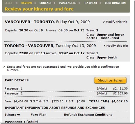
I finally get the results:
I can't say I'm that surprised at the cost, though I am surprised it says "discounted" berth. What's the discount? And why is passenger one paying $2,421 and passenger 2 paging $2,265 ($156 less)?
I continue on, thinking that at some point I'll put in the discount code and see the discount. I enter my name, fake address, fake phone, and get to the payment screen where they want my credit card number. No discount, no letting me know what the discount is.
At this point I think they have horrible software developers, and are hiding something. They feel worse than the airlines to me.
Out of curiosity, I check on Amtrak and look over some deals they have. Their site was inifinitely easier for me to find specials, and get a price along with the results when I searched on dates. Not a lot faster at times, but definitely easier to use. I didn't compare prices at all.
I buy airline tickets 5-6 times a year, and at no time have I had as much of a hassle in finding a price as I did on the VIA Rail site. Likely I'll not be considering a trip across Canada by rail anytime soon.


No comments:
Post a Comment